Chartway Brand Microsite


![]()
Let’s get started.
- What’s at the core of the Chartway brand?
- What are our fundamental design elements?
- How do we get started with new layouts and marketing?
- Answering those questions is what this guide is all about.
- Inside, you’ll find insights into how we communicate our brand, as well as practical references to colors, type, layout and more.
![]()
PURPOSE & VALUE
Chartway Credit Union is an organization led by its Purpose and Values. By codifying these principles, we define why we exist, as well as the motivations and philosophy that drive our actions.
Our Purpose
Unlocking the potential of individuals and families so they can thrive.
We Values
RELATIONSHIPS
Because human connection and kindness are the basis of trust and how we create real solutions.
DIFFERENCES
Because welcoming diversity of thought, ability, and perspective makes us all stronger.
COMMUNITY
CommunityBecause the people we serve and the places they live are connected, and they thrive together.
WE VALUE QUALITY
We Value QualityBecause we pursue excellence and are determined to find opportunity in every challenge.
Personality
Think of Chartway Credit Union as a person. How do we define its character? What traits and attributes rise to the top? How do they act?
These attributes lead our personality and help set direction for tone, style and design — defining it in human terms.
inclusive
Many backgrounds, viewpoints, and life experiences enrich us all. We love our communities and bring our best to thrive — together.
optimistic
Some things are hard. Maybe even improbable. But that doesn’t mean we can’t get it done.
passionate
The world needs your potential, so we work hard to clear your way forward.
empowering
We see the potential inside the person, and embrace everyone’s authentic self.
Personas
Personas are data-driven, based on a Segmentation Strategy leveraging robust first and third party data about our members and our markets. They represent who is growing in our membership, and who we are working to attract more of to the credit union.
Personas humanize that data so that we are focused on empathizing and connecting with our members. They help us understand the needs and emotions of our members, instead of focusing only on product cross-selling.
They empower leaders within the credit union to create more human-centered strategies, and empower all team members with knowledge to enhance day- to-day interactions.
Our brand helps us connect with relevance to our personas, and to attract more of our target growth audiences to the credit union.
GROWTH

EXPECTING EMILY
Life Triggers
- New Baby
- Moving
- Remodeling
- Career changes
Financial Behaviors Of Peer Group
- Student loans
- Personal loans
- Purchasing a used vehicle
- Mortgage refinance
- Home improvement loan
- Bankruptcy
EXPECTING EMILY
Life Triggers
- New Baby
- Moving
- Remodeling
- Career changes
Financial Behaviors Of Peer Group
- Student loans
- Personal loans
- Purchasing a used vehicle
- Mortgage refinance
- Home improvement loan
- Bankruptcy

SUPERMOM SABRINA
Life Triggers
- New driver in household
- Kids graduating high school
- Kids graduating high school
- Health scare
Financial Behaviors Of Peer Group
- Personal loans
- Prepaid debit cards
- Check cashing and cash advance services
- Not actively building retirement or investing
- Inconsistent health insurance coverage

Motivated Max
Life Triggers
- New driver
- Child graduating high school
- Child to college
- Promotion
- Health scare
Financial Behaviors Of Peer Group
- Auto loans
- Credit balances
- Student loans
- Personal loans
- 401 (k)s
- 529 College Savings Accounts
- Mobile banking
- Use internet banks
RETENTION

Almost Empty-nest Amy
Life Triggers
- New driver
- Child graduating high school
- Child to college
- Promotion
- Health scare
Financial Behaviors Of Peer Group
- Impressive 401K account balances
- 529 College Savings Plans
- Online investing
- Internet banking
- Mutual funds
- home improvement loans
- Refinancing
- Using multiple credit cards

New Grandpa Gary
Life Triggers
- First grandchild
- Empty nesters
- Retirement
- Health Expenses
- Aging Parent
- Death of a Parent
Financial Behaviors Of Peer Group
- High balances in 401Ks and IRAs
- Own real estate investments
- 529 College Savings Plans
- Use Financial Planners & Stock Brokers
- Use multiple credit cards

Moving In Monica
Life Triggers
- Engagement
- Marriage
- Graduation
- New Job
- Promotion
- Moving
Financial Behaviors Of Peer Group
- New to their financial institution within a year
- Some do not use banks at all
- Student loans
- Manage finances on mobile device
- Low income-producing assets
- Use check cashing and cash advance services
- Use prepaid debit cards
Logo
The logo is a critical element in telling the Chartway story. It's solid yet flexible. Strong yet approachable. Simple yet distinctive.
The logotype is modern and clean, but still has a sense of friendliness and warmth. To put it casually, it plays the straight man in the double act with the icon.
The icon from the logo is representative of many things. It's a burst of energy and fun. An emanating light to guide the way forward. The releasing of potential. A beaming expression of joy. A brilliant C. We choose not to keep it in a box and define it just one way, because we know that people aren't just one thing.
But no matter where they're headed or what they're after, Chartway is the right way.
Full Color
Light Reverse
Dark Reverse
Full Reverse
Black
Clear Space
Every logo needs a bit of personal space. Graphics, text and other logos shouldn’t encroach too closely so the Chartway logo gets its time to shine. Here, the amount of clear space is defined by the x-height of the ”a” in Chartway.
Color
Our pool and energetic color palette reflects our personality traits of optimism and empowerment. And it’s tied directly to our Brand Essence: pool Way Forward.
Color is an instant identifier for Chartway, and we don’t shy away from using it.
Blueberry and Pool do the heavy lifting, and Margarita is a bit more of an accent color.
blueberry
HEX 002855
RGB 0 40 85
CMYK 100 69 8 54
PANTONE 295 C
margarita
HEX C4D600
RGB 196 214 0
CMYK 28 0 100 0
PANTONE 382 C
pool
HEX 05C3DE
RGB 5 195 222
CMYK 68 0 13 0
PANTONE 311 C

Full Color
To ensure proper color contrast in web applications, check the contrast ratio of the two colors you plan to use.
Color combos that fall below the recommended contrast ratio should be used for design elements and accents — not important text.
Combinations that meet or exceed 4.5 pass Web Content Accessibility Guidelines color contrast requirements.
They are marked with.

6.8

2.1

1.3
9.0

1.3
1.6

14.6

6.8

9.0
14.6
2.1
1.6
Typography
Deceptively simple yet incredibly flexible, Chartway’s message is delivered by the Forma DJR Micro type family.
It’s a clean, simple serif that doesn’t feel unapproachably modern, but maintains a sense of expertise and sophistication.
Your future just got a little brighter.
Chartway
It's time to shine on. You belong here.
Forma DJR Micro
Deceptively simple yet incredibly flexible, Chartway’s message is delivered by the Forma DJR Micro type family. It’s a clean, simple serif that doesn’t feel unapproachably modern, but maintains a sense of expertise and sophistication.
Type something here to try Forma DJR Micro
Type something here to try Forma DJR Micro
Tahoma
Tahoma is a substitute font for when Forma DJR Micro is not available or accessible on certain documents or team member’s computers.
Type something here to try Tahoma
Type something here to try Tahoma
Font Usage
Here is a guide for using our fonts to make sure that we consistently communicate our identity to our members.
For headlines, use Forma DJR Micro Bold.
When there is more than one line of copy, use a leading size 3 points larger than the font size.
Example: 25pt font size requires 28pt leading.
For subheads, use Forma DJR Micro Medium.
When emphasizing certain words, use two font weights above the rest of the copy along with the reversed color.
Example: This example sentence is in Roboto Regular, so the emphasized words are in Roboto Medium and pool.
For body copy, use Roboto Regular.
In the case a bolded word is at the end of a sentence, do not bold the punctuation.
Do not in any case use italic variations.
Always use sentence case.
Do: This is how our copy looks
Don’t: This Is How Our Copy Shouldn’t Look.
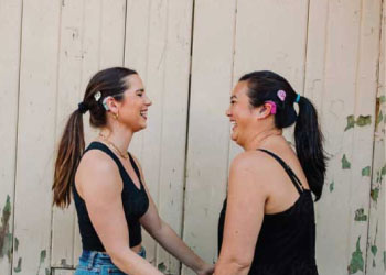
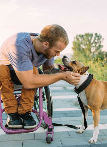
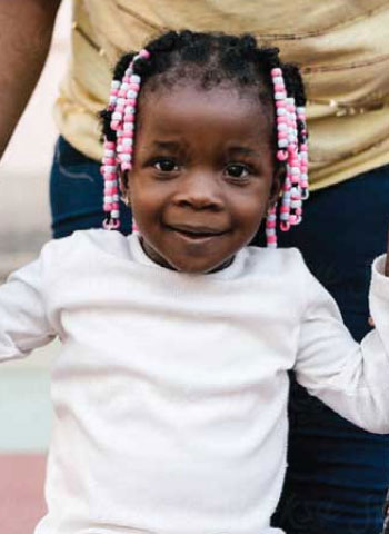
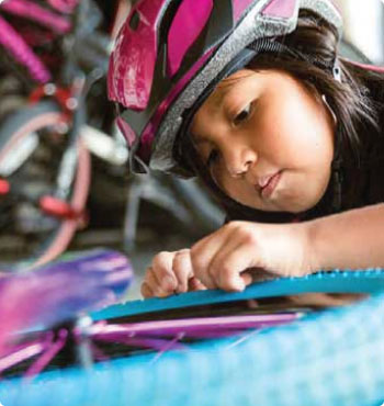
Photography
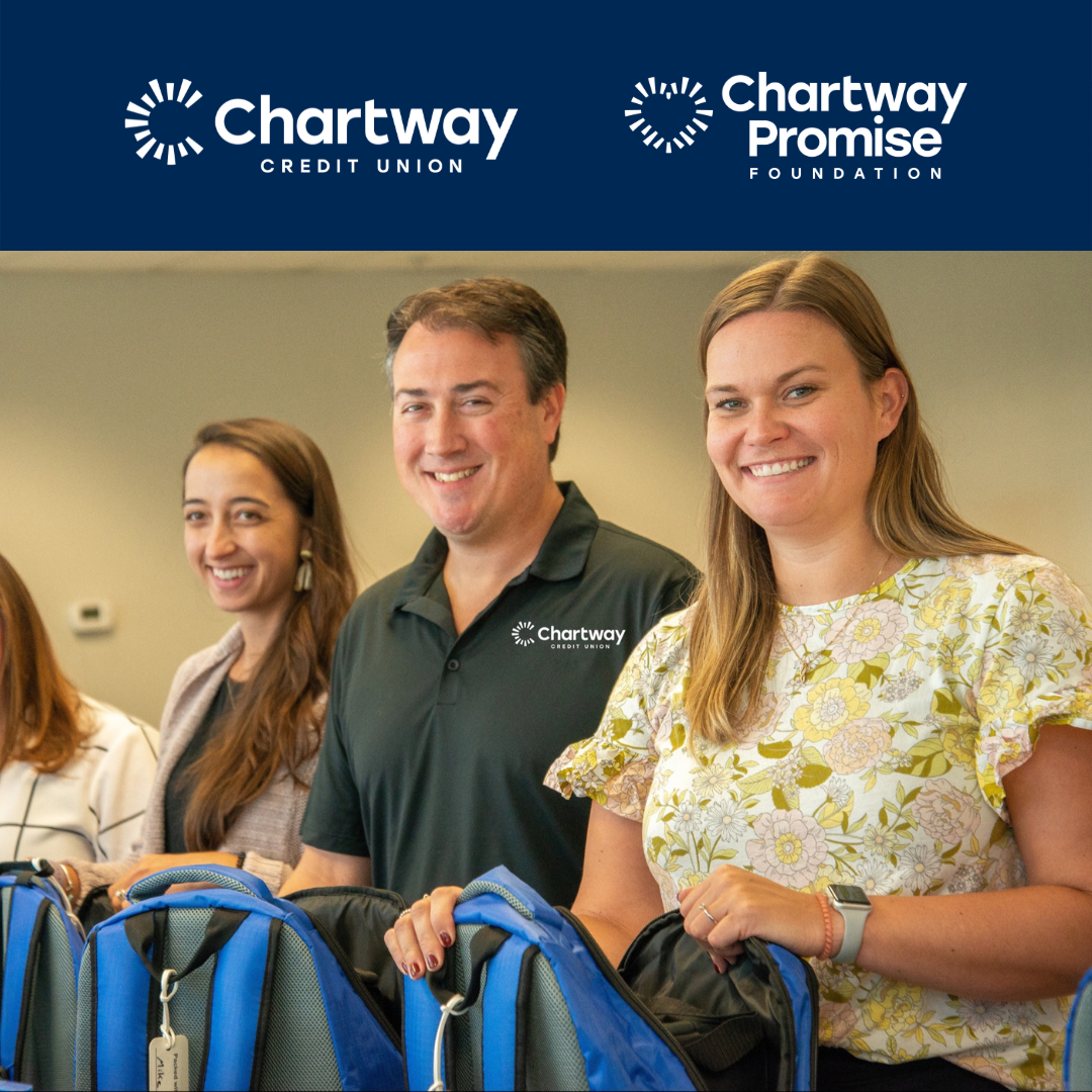
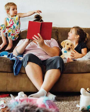
Photos should evoke warmth and positivity while maintaining a sense of authenticity. Representing a diverse community is also paramount. Smiles abound, but no overly-posed glamour shots welcome. The people on the other side of the lens should feel like people—not models.


Icons
Icons will come from the font awesome 6 family and use the "this" style. The icons below are approved for use with their respective projects.
Voice
Writing in the Chartway Credit Union brand voice starts by thinking of the brand in human terms — not as a corporate financial institution.
At Chartway, our voice is positive and optimistic. Bright Way Forward, is the essence of our brand. So naturally, our voice is positive and optimistic. We speak to both achievement and potential, in a way that is both human and approachable. Our voice is the perfect place to show off our personality.
MESSAGE
OFF-BRAND EXAMPLE
ON-BRAND EXAMPLE
BRAND FOCUS
We deliver great banking.
Your future just got a little brighter.
POTENTIAL
Our banking unlocks your potential.
If it's within you, it's within reach.
RATES
Home rates have never been this low. Act now.
Your ‘someday' is right now.
APPLY
Apply now. It's easy.
Get started now, and unlock your possible.
JOIN
Become a member of Chartway Credit Union.
It's time to shine on.You belong here.
Layout
The Chartway brand is comprised of cohesive yet varied layout styles. Each of these layouts — Squared, Burst, and Wedge — use the same brand elements in different ways to achieve a different vibe, style, and approach.
That way, the brand as a whole is always visually connected, but never cookie-cutter. We’ll go into more detail on each style in the following pages.
SQUARED

This is a
headline.
Subhead goes here.
WEDGE

This is a
headline.
Subhead goes here.
BURST
This is a
headline.
SQUARED
Squared layouts are polished & clean photo-driven approach.
Here, the layout gets broken up into part color, and part photo—or full photo. The Chartway “C” is baked into the color section as a textural background element.
This layout is simple to execute and super flexible, so it adaptas well to different mediums and applications.
SQUARED
This is a
headline.
Subhead goes here.
This layout is more color than photo.

This is a
long &
impactful
headline.

- 1 Note the sections of the “C” icon acting as an interlocking graphic strip.
- 2 Certain headlines may call for a little emphasis on a word or phrase. Using a mix of regular and bold weight provides a visual cue.
- 3 Here, the layout goes full photo for maximum impact.
This is a
headline.
And some body copy. Lorem ipsum dolor sit amet, consec tetuer adipiscing elit, sed diam nonummy nibh euismod tinci

- 1 The “C” icon acts as background texture.
BURST
Burst layouts are energetic and playful with a strong visual tie to the Chartway logo. They can really pack a graphic punch.
Here, the Chartway “C” gets a center stage. It fills the layout and breaks off the edge, while the circular counterspace in the center holds a photo.
Take care to find a photo with centralized subject matter, that way nothing gets lost when it’s dropped into the circular mask.
This is a
headline.
And some body copy. Lorem ipsum dolor sit amet, consectetuer adipiscing elit.
The copy can drift on top of the photo, provided there's enough contrast for the copy to be legible.
BURST
This is a
headline.
We’re using Margarita here as an accent/support with Blueberry.
This is a headline.
BURST USAGE
When using the burst on layouts as a watermark, there are different opacities that have to be used depending on which color the mark is placed.
Pool on white 20% opacity

Blueberry on white 10% opacity

Blueberry on blueberry 100% opacity
Dark watermark HEX: 0f143e

Blueberry on pool 13% opacity

White on pool 25% opacity

Blueberry on margarita 7% opacity
WEDGE
Wedge layouts are simple and unexpected with a more subtle visual tie to logo than the burst, but with a ton of built-in variability.
The basic mechanics of the Wedge layout style involve the scaling up and cropping of a wedge shape pulled from the Chartway “C” icon, and using that as a mask for photography.
As evidenced by the visual examples, just by varying position, size, and cropping of the same shape, you can achieve a wide range of looks.
And just like with Burst layouts, photo selection is key for filling the wedge.
This is a
fun headline.
Centering the wedge gives it almost an exclamation mark feel, which can give off a celebratory vibe.

This is a
headline.
This is a
headline.
Subhead goes here.